First Time Working with Goatskin
This
December I had the chance to make a long-term service principality
award for someone with a Slavic persona. Honestly, I forgot the details
so I may be misremembering, but basically I used a page from the Peresopnytsia Gospel as inspiration because it was appropriate for the recipient so if I use the incorrect term for the persona, apologies.
My Laurel, Yrsa Kettilsdottir, and the Principality Scribe, Dáma Maminka
the Bohemian, kept poking me about documenting the process so you get a
ton of bad photos because I'm not a photographer!
My
spouse also got a few sheets of goatskin and I thought I'd use the
smallest piece of it for this project. I think it was about 7" square?
Not very big at all. I used the flesh side because it's supposed to be
smoother, but as you can see from this first picture it had a
suede-like texture.

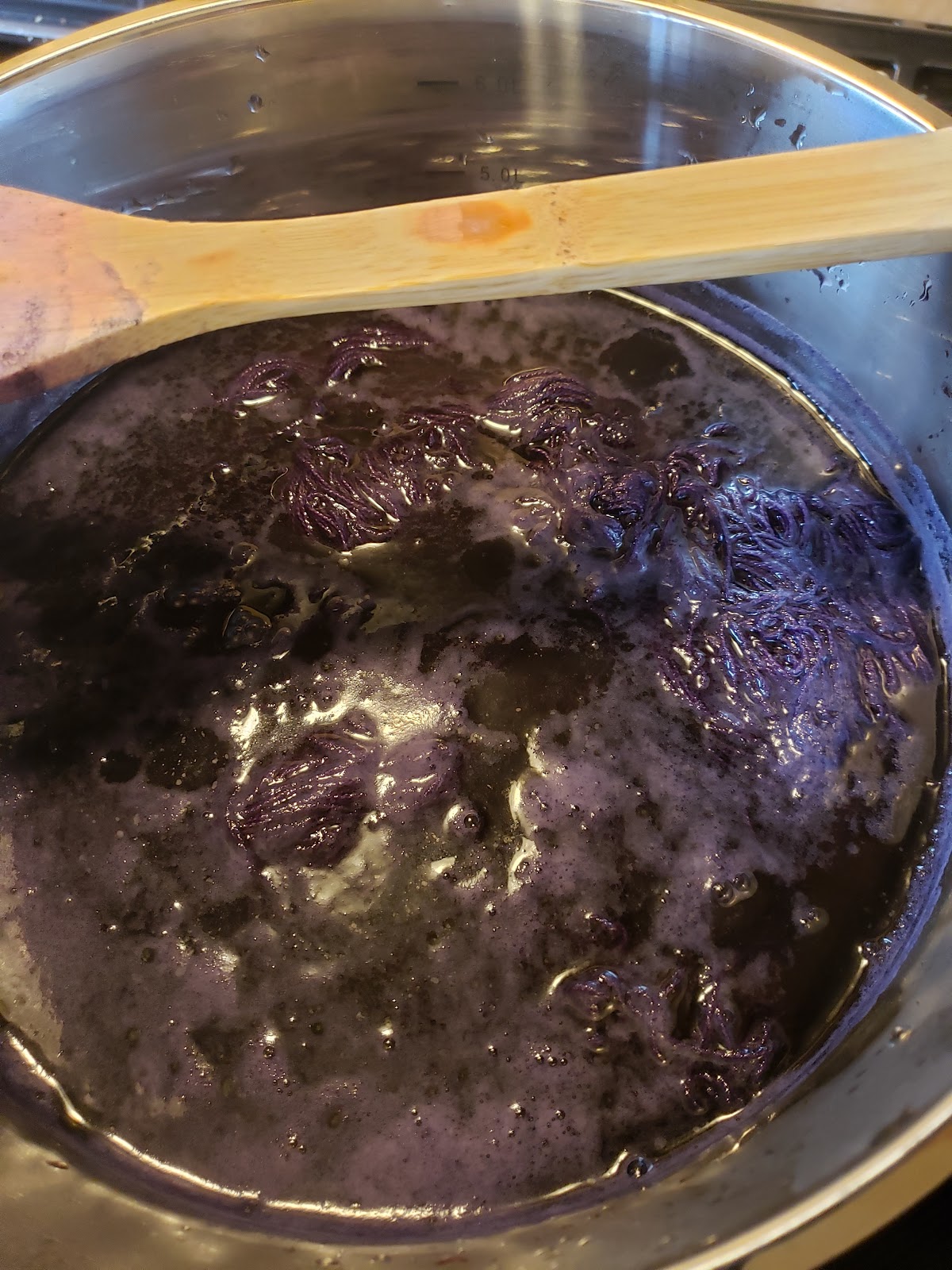
I
read online that pumice stone is recommended for smoothing so I grabbed
my unused foot scrubber because it's flat and a small piece of hematite
that I use because I keep forgetting to get a proper houndstooth.


It
was a bit of a disaster so I just smoothed the crap out of it with my
tiny hematite and tried not to worry about it due to time constraints.

Using
my light table, I traced a printout of the image I wanted to use (first
attempt visible in upper right corner). However, I couldn't find a
high-definition scan and gilt doesn't photograph well so I did my best
and reminded myself that extant knotwork wasn't always perfect, even
though this particular one was. I used my circle templates to make the
rings.

Then
I put the pencil draft under the goatskin on the light table.
Shockingly, goatskin isn't terribly transparent. In the pencil layer I
discovered that graphite transfers ridiculously easily and erasers don't
work on parchment (there's a quality difference between vellum and
parchment that I don't remember at the moment and I don't particularly
care to split hairs so if I'm using the wrong term, you get it via
context), but it scrapes so beautifully compared to cold press!

Did
blind ruling for the first time and darned if I can remember the ink
and nib size. As you can see, the ink bled a fair bit in the
particularly fleshy bits. Black-lined in micron.
The wording is transliterated using Boyarin Ivan Matfeevich Rezansky's article on medieval Cyrillic.
Superb resource, especially for people unfamiliar with the
International Phonetic Alphabet. Apologies to anyone who reads
Cyrillic, I'm pretty sure the recipient does not so I'm ok with this.
Plus, it means I can share in progress pictures with nearly everyone
because of how few people can read it.

Someone suggested using gesso to take the 3D glasses effect to the next level, but that would be yet another learning curve that I didn't want to add, especially in such narrow channels. The gold is mica powder mixed with water and gum arabic.

It
was only after the clean-up stage that I realized I forgot the award
badge. I managed to squeeze it in between the legs of the K (either
that or on the side of the central spire to be balanced with the seal),
but didn't remember to take a photo of it.
It's not as perfect as the exemplar, but I'm still quite happy with it.


Comments
Post a Comment